
Dynamic Time Warping (DTW) is really interesting; it isn't something that is very well know (which is one of the reasons I'm writing this post), but it has a lot of valuable applications and is surprisingly simple to use.
In this post I hope to demonstrate two things: How to use time stamped pressure data to confirm the path taken by the UPS trucks and correlate the pressure data to an exact location and time; and, how the same approach can be used to predict the speed of the vehicle at any given point along the route, and discuss how additional analysis can be conducted to predict the road quality along the package’s route.
Processing Data and Extracting Meaningful Results
We often forget as engineers the obvious - having the appropriate tools for the job is essential. This means both physical tools (equipment) as well as virtual tools such as software, data, algorithms, and libraries. Sensors for measuring pressure, temperature, magnetic fields, acceleration, and many other phenomena have become extremely affordable and miniaturized in recent years. When coupled with microcontrollers and ample storage, we are able to gather vast amounts of data on systems of interest. The next challenge comes in properly working with the data, processing it, and extracting meaningful results.
Countless resources are available for manipulating the data and processing it. This blog post takes a large amount of time, pressure, position, and elevation data to demonstrate how to reduce the size of the data to perform Dynamic Time Warping (DTW) and ultimately predict the location and speed of the package as it travels across the country.
DTW is a nice tool for data analysis and will be part of enDAQ's numerical processing and data analysis blog series. This series currently includes posts for;
- Algorithms such as Fast Fourier Transforms, and
- Software such as Matlab and Python.
For reference, the data I'm using for this post was discussed in two previous blog posts:
- Vibration Monitoring and What Really Happens During Shipment
- Using Pressure Data to Approximate Location
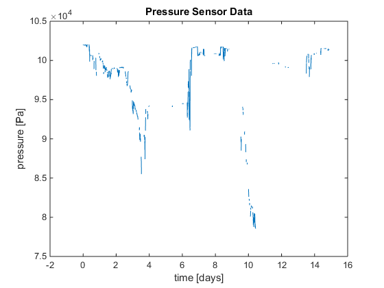
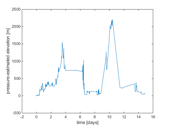
For analysis, the pressure data was converted to an altitude estimate. The pressure vs elevation relationship was assumed linear between atmospheric pressure and 2,000 meters elevation. Additionally, the diurnal variations in the atmospheric pressure and weather effects were ignored. This model can be improved in many ways, but the rough assumption is sufficient for this effort. The resulting elevation estimate is shown in the figure below.
GALLERY - Converting raw pressure data to an elevation estimate.

Dynamic Time Warping - History And Applications
Dynamic time warping is a data mining approach that is typically used for time series analysis. Data that is correctly ordered, but doesn’t have a particular time (or spatial) index. In instances like this, data may have been gathered in batches, or at different rates, so it does not accurately describe the phenomena of interest.
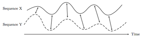
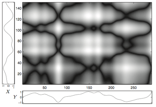
Mathematically, dynamic time warping requires two vectors of data. The two vectors are compared and a cost matrix is created that measures how far out of sync the two vectors are. There are several different ways to measure the cost, but a common one is the standard Euclidean distance. The goal is to minimize the total cost to achieve the ideal warping path, which relates the data points in the two vectors. The two figures below are from Müller, M. (2007). Information Retrieval for Music and Motion. Berlin, Germany: Springer-Verlag Berlin Heidelberg and show two data traces with potential points of alignment and a visualization of the cost matrix. The cost matrix shows all potential warping paths, but clearly demonstrates that there are some very low cost areas that can be followed to minimize the total cost (the black lines).
GALLERY - Dynamic Time Warping Examples
One of the earliest and most popular applications of dynamic time warping is speech recognition. Vintsyuk’s paper from 1969 discusses how DTW is an ideal solution to discern the differences in speech. Words, sentences, and syllabus are articulated differently from one person to another, but still represent the same things. The underlying form of these words is common with pronunciation and accents accounting for small variations. Other applications include hand writing recognition, RNA folding, and cardiac system monitoring.
Code For Dynamic Time Warping
Dynamic time warping has been around for a while and is well supported in may programming languages. Modern versions of Matlab also support DTW with the command dtw(). In this effort, the freely available Matlab code by Timothy Felty is used. The inputs to the DTW code are two vectors representing the two sequences to be time warped. The outputs are the accumulated cost matrix, normalizing factor, optimal warping path, and the cost (distance) between the two vectors.
The complete code used in this work is available for download at the end of this post.
Source of Route Information
From the UPS tracking info, the package locations at certain dates and times was provided as the package travelled from one UPS facility to another.
![]()
Table 1: Location, date, and time of the package based on the tracking history provided by UPS.
From this data, a route was created using google maps data. This website works with Google Map data and creates a spreadsheet containing [Latitude; Longitude; Elevation; Distance; Elevation Gradient]. The Google Maps algorithm chooses some optimal path between the two points to get you to your destination as fast as possible. Likewise, the UPS trucks travel from location to location with an optimal route to conserve fuel and time. We will assume that these two trajectories are very similar, which will allow us to consider the route data to be a ‘true’ reference. In the end, the DTW results will show if the assumption is accurate.
The resulting route generated from the website is shown in the figure below. 
Figure 3: Route generated from the UPS tracking history.
The resulting route based elevation data is shown next to the pressure based elevation estimated below in Figure 4. The data traces look very different, but still has two distinct peaks with low elevtions at the beginning, middle, and end.
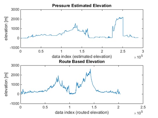
Figure 4: Pressure estimated elevation data (top) compared to the route based elevation data (bottom).
Data Reduction for Large Data Sets
When performing data analysis, the size of the data set must always be considered. If only a small amount of data is collected, it may be insufficient to reach any meaningful results. If excessive amounts of data are collected, it may become unwieldy and require more storage or high end processing capabilities. Choosing the correct amount of data will depend on the specific application and computational power available.
For example, the new 787 Dreamliner from Boeing is said to collect 500 GB of data per flight. On the surface, that may seem like an excessive amount of data, but for an aircraft having data at every point in time is essential so that any issues can be identified and tracked. Let’s use an enDAQ sensor datasheet (formerly known as Slam Stick X) to make a rough calculation to put that quantity into perspective. Assuming a 10 hour flight, with 14 bit sensors measuring at 20 kHz (such as an accelerometer), that is roughly 37 sensors. Of course other sensors will be used to measure pressure, strain, flow, current, voltage, and other parameters on the aircraft, and will probably do so at a lower rate than the accelerometer, but this demonstrates just how quickly the data can add up.
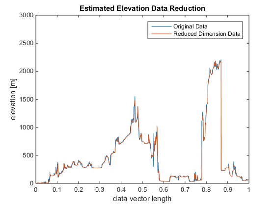
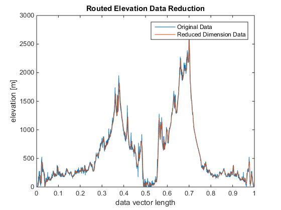
In this work, I have reduced the data in a simple approach by extracting every nth point and using those points for analysis. With n=1, the original data is used. A value of n<50 will be demanding for most desktops computers. A value as large as 20,000 will still provide recognizable (albeit very coarse!) results for this data. The original data and the reduced data are shown in the figure below.
GALLERY - Before and after raw data reduction.
Dynamic Time Warping Results
Manually Estimating What DTW Should Show
Through a visual inspection of the data, one can recognize the pattern and manually estimate where points on either curve should line up after DTW. In this case, I have identified 6 points labeled as [A, B, C, D, E, F] that I believe represent the same latitude and longitude locations. If these points are indeed the same location, they should be part of the ‘optimal path’ that is generated from the DTW algorithm.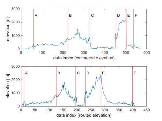
Figure 6: Manually predicting points that correspond to the same latitude and longitude from a visual inspection of the estimated elevation data and the route based elevation data.
MATLAB DTW Results
From the DTW algorithm, there are two key parameters that are provided. The accumulated distance matrix (D in the code) is used to generate the visualization of the cost for a particular DTW path. The second parameter is the optimal path (minimum cost, represented by w in the code. The following figure is visualization of the cost matrix (black and white) with the optimal path (red line) and the points that were estimated through manual inspection of the raw data.
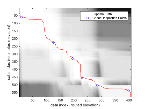
Figure 7: Cost matrix visualization for the elevation data. Lighter areas represent lower cost. The optimal path is drawn as well as the points that were predicted through visual inspection.
The figure shows that the areas of light coloring are low cost, while the areas of dark coloring are high cost. The optimal path remains in the white area. The manually estimated points are all very close to the optimal path, which reassures that the points are indeed the same location.
Using the indexing from the optimal warping path, the pressure-estimated elevation data (from the sensor) is plotted with the route based elevation data. In Figure 7 below, we see that the traces have very good agreement, which indicates that the path we selected (from the Google Maps routing information) for the UPS truck is reasonable and the pressure-estimated elevation data is accurate.
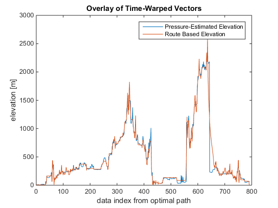
Figure 8: Comparisson of the pressure based elevation data and route based elevation data.
Estimating Position Based On Pressure Data
The round trip between Medford, MA, and Seattle, WA, took approximately 14 days via UPS Ground service. The pressure data gathered with the sensor included time stamp information, which can be used to estimate the location at any given time. This section demonstrates how to take a known time and extract position data.
First, the time of interest must be defined. For this demonstration, we will consider the interesting times to be 1 day after shipment, and every subsequent day until the unit returns to Medford, MA. After data reduction, the pressure data is in the reduced estimation matrix Red_Est = [[time];[pressure];[elevation estimate]]. In the time vector, the index of the closes time of interst is identified. This index is shared with the elevation estimate at that time. The warping matrix from Figure 7 is then used to identify the corresponding index in the route information matrix Red_rout_info = [[latitude];[longitude];[elevation];[delta miles]]. This corresponding index yields the latitude and longitude at that time. This process is repeated for all times of interest and the results provided in the table below. These points were then identified on the map, so that the location at each day could be shown.
GALLERY - Daily position estimates of the package.
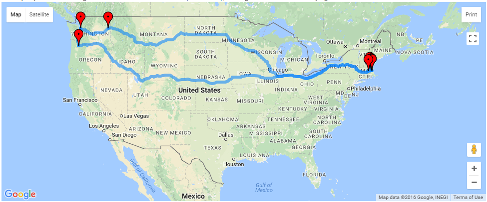
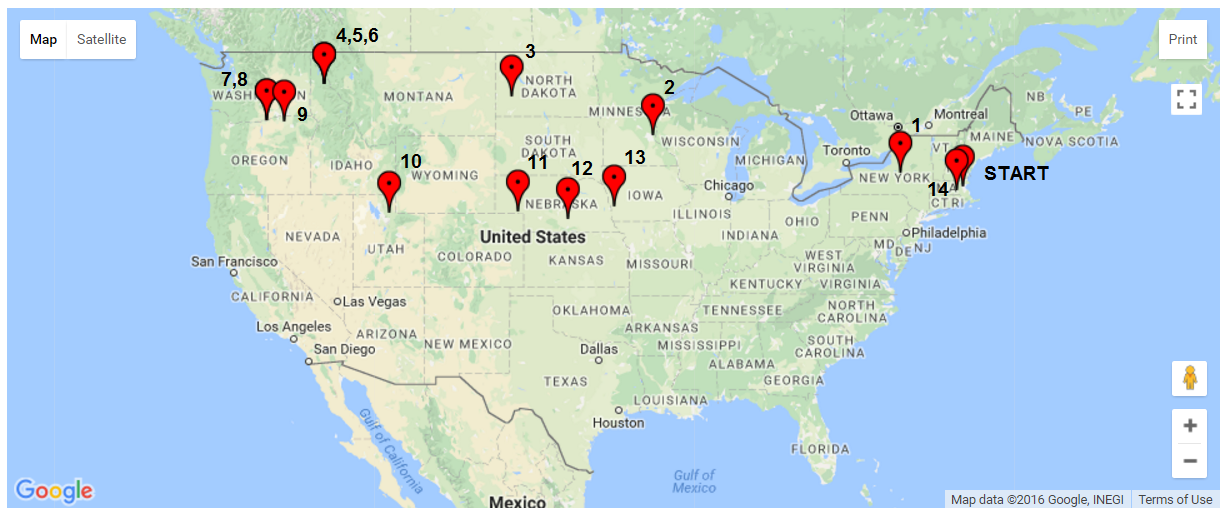
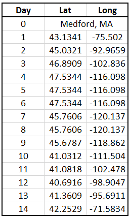
Figure 9: Original route mapped, location estimates after every 24 hours of travel, and position (latitude/longitude) estimates for each day. (screen shots from www.doogal.co.uk)
From the data, we can see the days where the UPS truck is travelling nearly all day and also the days where the package is at distribution facilities and doesn’t move for multiple days. One interesting area is in Nebraska. Here, it looks like the package was traveling very slow, indicating that it may have stopped at a sorting center. The trip on day 13 on the other hand was much longer at 1408 miles. Over 24 hours, that averages out to 58.7 mph. However, truck drivers are limited to the number of hours they can drive. Let’s assume that two drivers were involved and each drove for the limit of 11 hours. Over the 22 hours of drive time, that is an average speed of 64 mph.
How To Extend This Work To Estimate Speed And Road Conditions
Following the method used to estimate position based on the pressure data, the work can be extended to predict the vehicle speed. My approach looked at the average speed for the entire day, however the time scale is arbitrary. For simplicity, the reduced route info matrix (Red_rout_info) has delta miles data that is the road distance for that leg of the route. The merging of the time data and the distance data is straight forward based on the provided description and code.
Another interesting analysis of the data would be investigating the ride quality and correlating that to the location. The ride quality could be affected by many things such as the road condition, vehicle used, or the stacking of packages in the UPS truck. Pressure data and the corresponding time stamp are recorded every time the system sensed a 1G shock event. A preliminary review of the data shows that data was collected at a high frequency in the downtown Medford, MA area, which has poor quality roads. Data was collected more slowly when traveling on the Midwest highways, indicating a better ride quality.
Conclusions
In this blog, I have used real world data to demonstrate the process and benefits of dynamic time warping. We have seen that a small amount of data can be analyzed in unique ways to extract a lot of useful information. The path of the UPS shipment could be tracked as well as its location over time. The average speed can be estimated for arbitrary locations on the journey. With more analysis, a more detailed estimate of the vehicle’s speed over time can be extracted and even a prediction of the road conditions.
As engineers, we instrument equipment under study with many different kinds of sensors to get as much data as possible. More than ever, it is essential for us to understand what tools are available and how to use those tools is essential in data analysis. Consider subscribing to enDAQ’s blog to see additional data analysis tools and methods.
For more on this topic, visit our dedicated Environmental Sensors resource page. There you’ll find more blog posts, case studies, webinars, software, and products focused on your environmental testing and analysis needs.